fbpx

Nguyễn Ngọc Thư – winner of VFCD graphic design contest 2021: I want to radiate the love for Vietnamese culture to everyone

At the age of 21, as the youngest contestant among the Top 5 finalists of “VFCD Graphic Design Contest 2021: Key Visual & Creative Merchandise”, Nguyễn Ngọc Thư won over the jury in the final round and was crowned the best prize with her idea: “Balancing the intersections”.

At the age of 21, as the youngest contestant among the Top 5 finalists of “VFCD Graphic Design Contest 2021: Key Visual & Creative Merchandise”, Nguyễn Ngọc Thư won over the jury in the final round and was crowned the best prize with her idea: “Balancing the intersections”. Thư’s design “earned the points” by creatively exploring and combining sophisticated observations with emotions from ordinary everyday life to offer a solution – a perfect balance of modernity and tradition, yet still holds potential in terms of applicability.

In this conversation, Thư shared with VFCD her experience joining the contest and the unforgettable memories along the way.

Nguyễn Ngọc Thư (21 years old) has just won the First Prize of VFCD Graphic Design Contest 2021.

How did you know about this contest? And what made you decide to be part of it?

It was thanks to a Facebook group for creatives sharing the information that I learned about the contest. As to why I decided to enter, for a long time I had been pondering a personal KV (key visual) project using Vietnam’s traditional elements, so with the contest coming along I just took the opportunity, just to try it out without thinking much. The second reason is to challenge and evaluate my own ability.

What do you think about the topic “Creative Future: How the cultural and creative industries enhance the social and economic development of Vietnam and promote the smart development of Vietnam’s major cities”?

I think all aspects of life need creativity, creativity helps us convey the message, the vision, as well as the goal. The contest topic centered on the role of cultural industries in enhancing economic development, which reflects the goodwill and relentless effort in creating changes and improvement for a better quality of life. An inspiring topic that motivates people to generate breakthrough innovations, thereby together spreading positive messages and heading towards a brighter future.

As you entered the contest, did you set out certain goals or criteria for your design?

How to symbolise images from everyday life so that everyone can understand once they see them. That was the goal I set out for myself right from the beginning.

What was the creative process for your contest entry from conceptualisation to execution, and how long did it take?

I spent around two weeks on the design concept. As I wanted to create something close to people’s hearts, I rummaged through all these street photos I took over the years, and then decided to use the image of the street vendors as the starting point, with “balance” and “intersection” as the two key elements. And then, when I tried placing “balance” and “intersection” onto other images, I realised that those two elements exist in everything. Once the key elements of the design were determined, things proceeded pretty quick. I continued to develop other elements, started sketching by hand and then on the computer, and it took just one morning to complete the KV. After that, with around one week left until the deadline, I started working on different KV applications for social media.

The key visual elements designed by Nguyễn Ngọc Thư for VFCD Graphic Design Contest 2021

Why did you choose the street vendors as the source of inspiration for the whole design?

This image is a part of my childhood. When I was a kid, I used to hang out in the streets and from time to time, I met these street vendors who would give me things they had not been able to sell. Sometimes they would ask me to help look over their stalls. More often than not they were people from the outer provinces. On their shoulders, they carried delicious specialties from every corner of the country. It was a genuine image of diligent mothers and sisters bearing the age-old cultural beauty, which has been carved in the subconscious of many people during their childhoods. And I want to start with something as close to our hearts as that.

Did you encounter difficulties during the execution process? How did you overcome those?

Probably the most difficult thing was to decide on a colour palette, since a KV needs certain stability to be easily applied on different communications platforms, it requires a highly adaptable palette. At first I thought of using colours from the water puppetry art, with red and green as the primary colours, but as I tried applying those to the design I found out that it was not enough to convey the spirit of the KV. After more research, I decided on a palette inspired by Hàng Trống folk paintings, which were known for their vibrant, diverse colours, befitting modern, symbolic design styles and could easily be adapted to both light and dark backgrounds.

Were you surprised to learn that you are selected as one of the top 5 contestants?

I was delighted and quite surprised, but the happy feeling went away quickly and then I started contemplating what to do next to deliver an impressive and effective pitch, how I should perfect the concept, and so I focused on further design applications.

So how did you prepare for your presentation in the final round?

I had 5 days to prepare for this round. In that week, I created more mockup designs and posters to demonstrate how adaptable my design is. I also developed a motion graphic.

What are you most pleased with in your entry? What difference would your design bring to VFCD’s visual identity compared to the previous years?

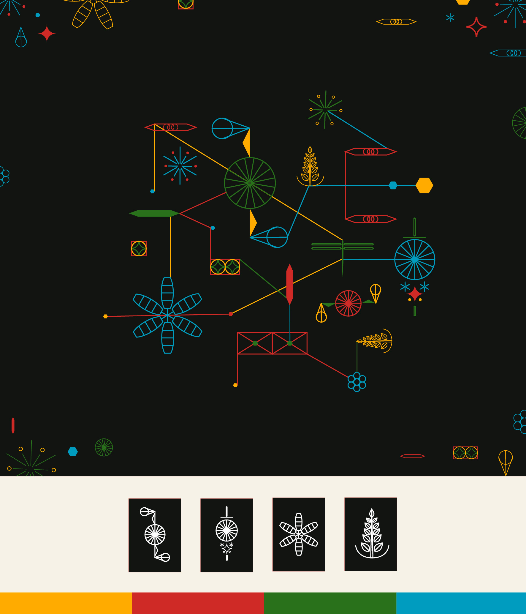
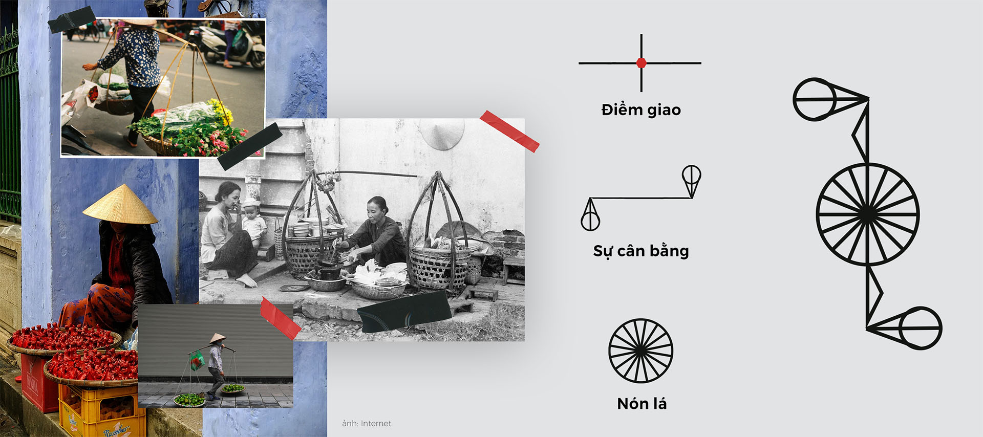
Probably what I’m most pleased with was the image of labour workers. As I wanted to bring the human touch to the design, I put a lot of work into concept development. The image of rice plants representing agriculture, the wooden toy dragonfly representing handicrafts, fireworks representing the wish for changes,… all revolve around work, life, and the perspective of working people, and they are also connected to each other, which represents a society that together grows and advances forward. That was the message I wanted to convey through the images.

Compared to the KV of VFCD in the previous years, I think the perceptible difference is the connection in the design, the elements linked to one another through the lines, creating a sense of movement, leading the viewer’s eyes to the visual journey which they could easily understand.

What do you think about the questions/comments from the jury towards you in the presentation round?

Thanks to the jury’s questions, I understand what my entry is lacking and what should be further developed. It is clear that this design needs a more coherent, thorough systemisation to be implemented on specific platforms.

How about the other contestants’ presentations?

Their entries were all amazing. The way they presented them was also incredible. I learned so much as everyone all had creative and professional ideas. Take Nguyễn Hoàng Mạnh Khang’s entry for example, he went through such a dedicated process developing a system of visuals, from doing extensive research on various industries to symbolising the images, which was not an easy feat.

As the Festival features multiple events ranging from the topic of traditions to modernity, involving various cultural industries such as fine art, photography & exhibitions, cinema, handicrafts, to architecture and fashion and more, what are your plans to further develop your design for these events?

I received the same question in the presentation round but could not think it through in time then. But by the end of the finale I already had my answer. My design would definitely need further systemisation for the KV application on specific platforms, and the elements based on balance and intersection can be further developed to convey the message of each event. I have thought of several images which could symbolise traditional art and architecture, such as the zither (đàn tranh) or pagodas,… However, too many elements could pose a problem so it does require selection, and what’s important is that these elements need to be familiar to traditional culture, and to everyday life.


This is the highest prize in a design competition that I have ever won. I feel happy, partly because my ability was evaluated to a certain extent… After this contest, I feel more confident to further develop myself in KV design and will continue to work on these skills. By using our country’s cultural elements in the designs, I want to express and radiate the love for Vietnamese culture to everyone.

Your design received quite many comments and positive responses, was there any comments you particularly remember?

My friend sent me a screenshot of a Facebook user’s comment, which said that the symbols in my design if separated look ordinary but when connected turn out really well. I really like that comment, because that was my initial idea: using ordinary images and basic shapes that people can see anywhere, but when creatively combined they can become an interesting piece of work.

A poster design in Nguyễn Ngọc Thư’s entry.

Could you share with us why you chose a career in graphic design?

Initially I pursued photography, for quite a long time actually. I started during my high school years, and upon the university entrance exam, I got accepted into the Faculty of Photojournalism at the Academy of Journalism & Communications. I also signed up for the Academy of Theatre and Cinema but then decided to stop after the preliminary round. Following a sleepless night between choices, pondering whether photography was enough for me, I realised that if I pursued graphic design I would have many more opportunities to grow in various aspects, I could learn and experience much more in this field, and also apply it to photography.

That was the turning point and until now I am still very content with my decision. I like the creative process, from conceptualising to sketching on paper then on the computer. I like expressing the images of my imagination in my own language. The creative design industry is truly essential and is growing, and I want to be a part of that growth.

As a Gen Z representative, what do you think about the role of Gen Z in the field of Applied Design today?

Every generation plays a part in creating the trademark of each period of time. For my generation, learning and developing design applications bring about a new, young, modern perspective that is somewhat bolder and more liberal, the approach towards a certain topic is quick, effective, and optimised in terms of conveying images. I notice that Gen Z are very firm in their personal opinions and perspectives, and they are also very confident and ready to roll up their sleeves to produce creative and innovative results.

What is your thought on using design as an instrument to preserve traditional elements?

I think it is highly recommended to utilise design in preserving culture. Especially in the era of digitalisation and everything is transforming constantly, it is necessary to preserve and symbolise traditional elements as these images could be captured in a concise, memorable format and applied to creative applications in a flexible, diverse manner, which would help to widely and effectively spread the traditional values.

Interview undertaken by Ngụy Hải An
Graphics by Rongchơi
Translated into English by Đinh Vũ Nhật Hồng
Images provided by Nguyễn Ngọc Thư

Kindly credit VFCD 2021 when sharing the article.
Please do not copy or repost without permission.